
Ever thought numbers could share secret stories? Picture boring charts turning into lively chats that reveal hidden patterns and spark action. In this post, we show how plain data can be spun into fun stories that help teams navigate every twist and turn. When facts become stories, they turn into friendly insights that guide choices and build trust. Let’s dive in and see how turning numbers into tales can light up our everyday challenges.
Understanding storytelling with data
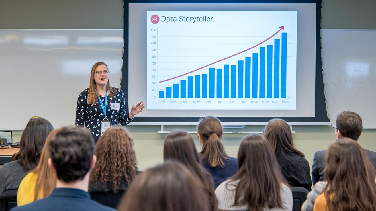
Data storytelling takes boring numbers and charts and turns them into stories that anyone can understand. It grabs a bunch of raw data and weaves it into a tale that connects the dots, making cold statistics feel alive and easy to remember. Think about it like taking a plain spreadsheet and turning it into a story that says, "When sales dropped, a hidden holiday spark led to a bold comeback." It's simple, clear, and full of heart.
This way of sharing information really matters because it gives everyone, from your team to your audience, a common language to talk about the numbers. When you know the story behind the data, it’s like watching a game where you don’t just see the final score but understand every play, every twist, and every strategy. This means the numbers aren’t just there; they point you toward real, practical actions.
Here are five core benefits of data storytelling:
- Clarity in communication – turning complicated data into easy-to-understand stories.
- Increased engagement – creating stories that stick with people and keep them interested.
- Improved decision-making – giving clear context so everyone knows what steps to take.
- Enhanced trust – building a shared understanding between team members.
- Focused insights – zeroing in on key trends by sharing only the most important details.
Using simple visuals and a clear story path, data storytelling bridges the gap between hard facts and everyday ideas. Picture your business performance like a thrilling game, every play explained, every trend clear. This kind of storytelling lights up discussions, brings everyone on the same page, and guides actions that really matter.
Core elements of storytelling with data

Reliable data is the bedrock of a great data story. It starts with solid numbers that set the stage for a clear, honest tale. Think of your data as the building blocks of a cool Lego tower, if one piece is wrong, the whole tower feels off. For instance, when you share quarterly sales trends, use complete, accurate figures so your audience gets the full picture without any confusing gaps.
Next comes the narrative arc. A story with a good arc introduces a challenge, offers clear insights, and shows practical solutions. Imagine you notice a sudden drop in customer activity. Your story should walk the audience through what happened, explain the current situation, and suggest steps to turn things around. You might say, "When our customer numbers started to fall, our team dived in to understand the real reasons." It keeps everything real and relatable.
Visual design is the final piece that pulls it all together. Charts, graphs, and diagrams aren’t just pretty pictures, they point out trends and contrasts. Use a line chart to show growth over time or a bar chart for side-by-side comparisons. A simple visual, like a graph that shows a big spike in sales after a promotion, can speak louder than words.
| Key Pillar | Description |
|---|---|
| Data Integrity | Accurate and complete numbers lay the foundation for trust. |
| Narrative Structure | A clear story arc that outlines the problem and leads to solutions. |
| Visual Design | Thoughtfully chosen visuals to simplify and highlight complex data. |
When these three parts work in sync, raw numbers transform into captivating insights that not only inform but also connect with your audience in a real, meaningful way.
Step-by-step guide to storytelling with data

-
Define your purpose
Begin with a clear goal that both meets your audience’s needs and drives your business forward. Think of it like planning an exciting road trip, you choose a destination that fires everyone up, which then shapes every move you make. -
Understand your audience
Know exactly who you're talking to. Are they data whizzes or busy leaders making quick decisions? Picture it like hosting a movie night, you pick films everyone can enjoy so that no one feels left out or confused. -
Build a narrative arc
Craft a story that grabs attention from the start, unfolds with meaningful insights, and clearly points to the next steps. Imagine your favorite story, where the setting unfolds, a challenge appears, and surprising twists lead to a satisfying conclusion. -
Use visuals intentionally
Pick visuals that help show trends and draw comparisons in a clear way. For example, a line chart can show growth over time like watching a flower slowly bloom, while a bar chart makes it easy to compare details side-by-side, much like checking scores in a game. -
Edit and refine for clarity
Trim away extra details so that only the most important points shine through. Think of it like sculpting clay, remove what's unnecessary to reveal the true shape of your message.
Each of these steps plays a vital role in turning raw data into a story that's as engaging as a live performance. By keeping things simple and focusing on what matters most, you invite your audience to see the whole picture without getting bogged down in the details.
Visual storytelling strategies in data narratives

Simplicity is key when you tell a story with data. Keeping visuals focused on one clear idea helps avoid confusion. Imagine a chart that shows just one trend, a clean line that rises or falls steadily, making it easy for everyone to see the main point right away.
Choosing the right type of chart makes all the difference. Line charts are great for showing how things change over time, while bar charts work perfectly for comparing numbers side by side. Picture a bar chart that highlights monthly sales figures; each bar pops out, so differences are simple to spot. This clear approach lets viewers focus on the message without getting lost in a jumble of mixed visuals.
Consistency ties the whole story together. Using the same colors and clear labels throughout is like following a map through a busy city. Simple notes or callouts on charts can point out important moments, like a sudden peak, that might otherwise be missed. These design choices turn a pile of raw numbers into a story that grabs your attention and keeps you engaged.
Real-world storytelling with data case studies

Business performance over time
Imagine a company noticing its sales slowly dipping over several months. They looked at a line chart showing monthly sales and quickly saw that their once-popular product was losing its shine. By comparing different time periods, they figured out exactly when the decline began. When the chart revealed a sharp fall followed by a steady bounce-back after a smart product change, everything fell into place. One team member said, "When we saw the decline, we made a key change that reversed the slip." That simple visual turned raw numbers into a story that drove a strategic shift in their offerings.
Customer subscription trends
In the fierce world of subscriptions, one company used visual storytelling to track how well it kept its customers. A series of bar charts showed clear spikes in cancellations during certain months. Each chart zoomed in on a specific month, spotlighting how the number of cancellations suddenly shot up. Breaking down these trends showed that even small tweaks to service or pricing could cause big changes in customer behavior. An analyst remarked, "The visuals made it clear that a small tweak in our plan could keep a whole segment of our subscribers." This vivid picture helped management refine their tactics to better meet customer needs.
Inventory stockout indicators
A busy retailer, worried about running out of stock during peak shopping times, turned to data visuals for help. Early-warning charts flagged even small dips in inventory before they became a big problem. The graphs captured moments when quick stock drops, paired with rising demand, sent clear red flags. One team member mentioned, "The early warning allowed us to act before losing sales." These charts weren’t just eye candy, they provided insights that led to smart decisions, keeping the shelves stocked when it mattered most.
Recommended tools and courses for storytelling with data

Interactive dashboards like Tableau, Microsoft Power BI, and Google Data Studio offer a fresh way to explore data. Instead of boring, static reports, these tools let you dive into vibrant visuals that reveal real business trends. Imagine seeing a sudden spike in sales on one day, turning a simple chart into a story that speaks to customer habits.
Data storytelling courses teach you how to transform raw numbers into an engaging narrative. They walk you through picking the perfect chart, like using a bar chart to compare monthly trends, and designing interactive dashboards that feel as dynamic as a live performance. In hands-on workshops, you work with real data, almost like setting up your own visual playbook.
One course to check out is "Digital storytelling explained for creatives." It offers fun exercises, clear software demos, and practical projects that make learning enjoyable. These classes don’t just show you how to use the tools; they help you create compelling stories from data that anyone can understand, making numbers a natural part of every conversation.
Final Words
In the action, we saw how data transforms into engaging narratives. The post walked through making sense of numbers by blending precision with storytelling. It covered the basics of structuring visuals, setting a clear purpose, and guiding viewers with intentional charts and clear labels.
The content also explored real-world examples that make raw figures relatable and useful. Embrace this approach, and you can craft a compelling data story that connects ideas and fuels smart decisions using storytelling with data.
FAQ
Q: What is storytelling with data?
A: The concept of storytelling with data means turning numbers and charts into clear, meaningful narratives that make information easy to understand and use. It gives context to statistics and builds shared insights.
Q: What are the 5 P’s of storytelling?
A: The five P’s of storytelling shape how data narratives connect. They include purpose, plot, pace, perspective, and points that drive the idea forward, helping to reveal insights in a relatable way.
Q: What are the 5 C’s of data visualization?
A: The 5 C’s of data visualization emphasize clarity, consistency, context, contrast, and creativity. These principles guide the creation of visuals that clearly display trends and insights without overwhelming the viewer.
Q: What is the first rule of storytelling with data?
A: The first rule of storytelling with data is to start with trusted and complete information. This key approach builds a solid foundation so the narrative stays accurate and reliable.
Q: What storytelling with data book and PDF resources are available?
A: The storytelling with data book and its PDF resources offer a practical guide to turning numbers into narratives. Free downloads and GitHub links are available online for anyone looking to learn these essential techniques.
Q: Where can I find storytelling with data examples and practice activities?
A: Real examples and practice activities illustrate how to transform complex data into clear stories. They show different methods and tools that help you experiment with creating engaging data narratives.
Q: Is there free access to storytelling with data content?
A: Some platforms offer free storytelling with data resources. They let you explore the key ideas and try out practical exercises and templates without needing a paid subscription.
Q: What are the options for storytelling with data presentation materials?
A: Presentation tools like PPT designs and pie charts are available for storytelling with data. These resources help you visually share insights and present data in a clear, engaging format.
Q: What courses and certifications are offered for storytelling with data?
A: Educational resources such as courses, trainings, certifications, and audiobooks teach effective data storytelling techniques. These programs help you master narrative structure, visual design, and actionable insights.